


Lorem Ipsum is simply dummy text of the printing and typesetting industry. Lorem Ipsum has been the industry's standard dummy text ever
Jessica WatsonTheme Components
This is a quick showcase of some of the main Bootstrap components that come with this template.
Accordion
Block components used to create an Accordion using Bootstrap' collapse plugin.
Option one
Pellentesque habitant morbi tristique senectus et netus et malesuada fames ac turpis egestas. Vestibulum tortor quam, feugiat vitae, ultricies eget, tempor sit amet, ante. Donec eu libero sit amet quam egestas semper. Aenean ultricies mi vitae est. Mauris placerat eleifend leo. Quisque sit amet est et sapien ullamcorper pharetra. Vestibulum erat wisi, condimentum sed, commodo vitae, ornare sit amet, wisi. Aenean fermentum, elit eget tincidunt condimentum, eros ipsum rutrum orci, sagittis tempus lacus enim ac dui.
Donec non enim in turpis pulvinar facilisis. Ut felis. Praesent dapibus, neque id cursus faucibus, tortor neque egestas augue, eu vulputate magna eros eu erat. Aliquam erat volutpat. Nam dui mi, tincidunt quis, accumsan porttitor, facilisis luctus, metus
Paypal
Pay on delivery
const [collapse, setCollapse] = React.useState(1)

return (
<div role="tablist">
    <Card className="border-0 shadow mb-3">
        <CardHeader onClick={() => setCollapse(1)} id="headingOne" role="tab" className="bg-primary-100 border-0 py-0">
            <span style={{ cursor: "pointer" }} className="text-primary accordion-link">Option one</span>
        </CardHeader>
        <Collapse isOpen={collapse === 1}>
            <CardBody className="py-5">
                <p className="text-muted">...</p>
                <p className="text-muted mb-0">...</p>
            </CardBody>
        </Collapse>
    </Card>
    <Card className="border-0 shadow mb-3">
        <CardHeader onClick={() => setCollapse(2)} id="headingOne" role="tab" className="bg-primary-100 border-0 py-0">
            <span style={{ cursor: "pointer" }} className="text-primary accordion-link">Option one</span>
        </CardHeader>
        <Collapse isOpen={collapse === 2}>
            <CardBody className="py-5">
                <p className="text-muted">...</p>
                <p className="text-muted mb-0">...</p>
            </CardBody>
        </Collapse>
    </Card>
</div>
        )
Cards
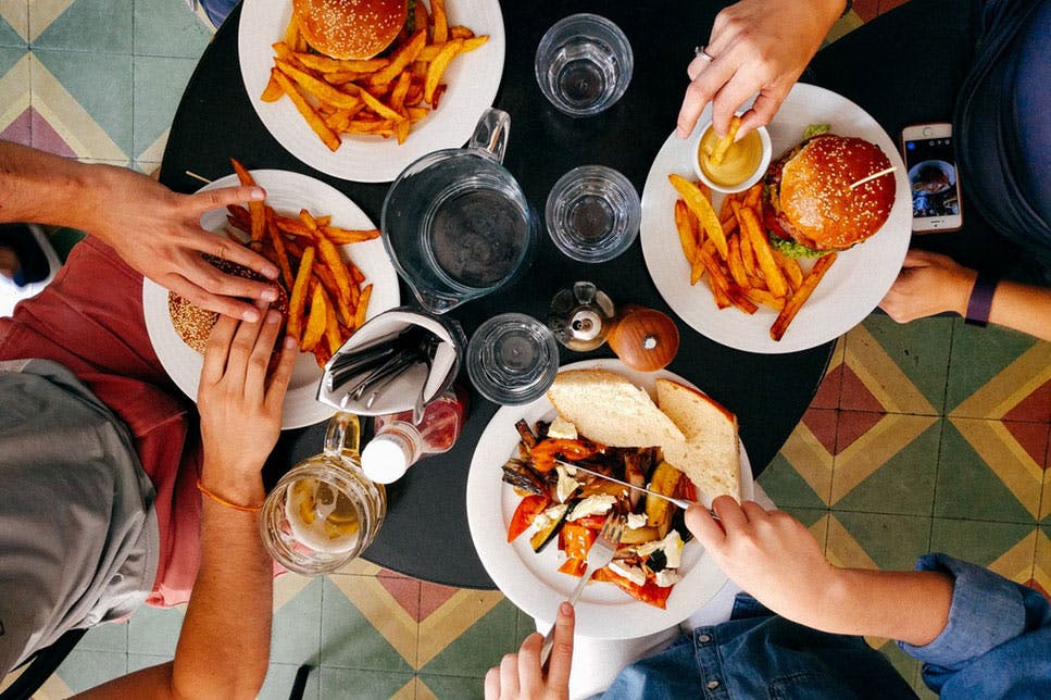
This theme comes with a variety of card styles useful for directory and marketplace websites.
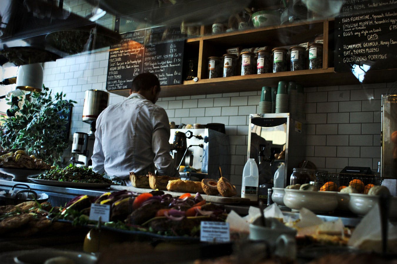
Restaurant
Cupidatat excepteur non dolore laborum et quis nostrud veniam dolore deserunt. Pariatur dolore ut in elit id nulla....
Proident irure eiusmod velit veniam consectetur id minim irure et nostrud mollit magna velit. Commodo amet proident...
Lorem amet ex duis in et fugiat consectetur laborum eiusmod labore. Quis cupidatat et do dolor in in magna. Eu sit ...
import CardRestaurant from '../../CardRestaurant'

import geoJSON from './public/content/restaurants-geojson.json'

export default () => {
    return (
        geoJSON.features.map(restaurant =>
            <CardRestaurant data={restaurant.properties} />
        )
    )
}
Room
import CardRoom from '../../CardRoom'

import geoJSON from './public/content/rooms-geojson.json'

export default () => {
    return (
        geoJSON.features.map(room =>
            <CardRestaurant data={room.properties} />
        )
    )
}
Property
import CardProperty from '../../CardProperty'

import properties from './public/content/properties.json'

export default () => {
    return (
        properties.map(property =>
            <CardProperty data={property} />
        )
    )
}
Card with a background image
import CardPoster from '../../CardPoster'

import posters from './public/content/posters.json'

export default () => {
    return (
        posters.map(poster =>
            <CardPoster data={poster} />
        )
    )
}
Blog Post
Travel
Escape the city today
January 16, 2016
Is am hastily invited settled at limited civilly fortune me. Really spring in extent an by. Judge but built party world...
Continue readingTravel
Autumn fashion tips and tricks
January 16, 2016
Pellentesque habitant morbi tristique senectus. Vestibulum tortor quam, feugiat vitae, ultricies ege...
Continue readingLiving
Newest photo apps
January 16, 2016
ellentesque habitant morbi tristique senectus et netus et malesuada fames ac turpis egestas. Vestibu...
Continue readingimport CardPost from '../../CardPost'
import posts from './public/content/posts.json'
export default () => {
return (
posts.map(post =>
<CardPost data={post} />
)
)
}Review
Padmé Amidala
One morning, when Gregor Samsa woke from troubled dreams, he found himself transformed in his bed into a horrible vermin. He lay on his armour-like back, and if he lifted his head a little he could see his brown belly, slightly domed and divided by arches into stiff sections
Luke Skywalker
The bedding was hardly able to cover it and seemed ready to slide off any moment. His many legs, pitifully thin compared with the size of the rest of him, waved about helplessly as he looked. 'What's happened to me?' he thought. It wasn't a dream.
Princess Leia
His room, a proper human room although a little too small, lay peacefully between its four familiar walls. A collection of textile samples lay spread out on the table.
import CardReview from '../../CardReview'

import reviews from './public/content/reviews.json'

export default () => {
    return (
        reviews.map(review =>
            <CardReview data={review} />
        )
    )
}
Team member
Meredith Goodwin
CEO & Founder
Weeks Garrett
Co-founder
Fisher Bauer
CTO
import CardTeam from '../../CardTeam'

import teams from './public/content/teams.json'

export default () => {
    return (
        teams.map(team =>
            <CardTeam data={team} />
        )
    )
}
Testimonial
Lorem Ipsum is simply dummy text of the printing and typesetting industry. Lorem Ipsum has been the industry's standard dummy text ever
Jessica Watsonimport CardTestimonial from '../../CardTestimonial'
import testimonials from './public/content/testimonials.json'
export default () => {
return (
testimonials.map(testimonial =>
<CardTestimonial data={testimonial} />
)
)
}Gallery with lightbox
A simple gallery using the React Image Lightbox as the lightbox.
React Image Lightbox is a responsive lightbox & dialog script with focus on performance and providing best experience for user with any device.
Supported props for Gallery component:
- rowClasses - classes for
Rowelement - colClasses - classes for
Colelement - data - images object
- xs - extra small column size
- sm - small column size
- md - medium column size
- lg - large column size
- xl - extra large column size
import Gallery from '../components/Gallery'

import data from 'data.json'

export default () => {
    return (
        <Gallery
            rowClasses="ml-n1 mr-n1"
            lg="4"
            xs="6"
            colClasses="px-1 mb-2"
            data={data.gallery}

        />
    )
}
Images
Since Version 1.1, this theme uses Next.js next/image component for image optimization.
It has many features, e.g., automatically creates srcsets for your images, serves WebP versions for your Jpegs, and lazy loads the images. For more information, check out next.js docs.
We developed <CustomImage /> component for usage with next export since, by default, static export won't work without using paid external loaders. Using this component, your static export will use normal <img /> element instead of Next.js <Image /> component.
Usage of <CustomImage /> component:
You can use the same props as the next/image component has.
import Image from './components/CustomImage'

export default () => {
  return (
    <Image
      src="/some/src.jpg"
      alt="..."
      width={1080}
      height={720}
      layout="intrinsic"
      className="img-fluid card-img-top"
  />
  )
}
To setup your project for static export, following configuration is needed.
next.config.js
{
  images: {
    deviceSizes: [320, 480, 640, 750, 828, 1080, 1200, 1920, 2048, 3840],
    // loader: "imgix", // Uncoment this line
    // path: "", // Uncoment this line
  },
  env: {
    production_type: "server", // Change variable to "static"
  },
  // trailingSlash: true, // Uncoment this line
},
Maps
Maps inside this theme use React Leaflet and tiles from Carto Maps.
A big advantage compared to Google Maps is that these maps are free to use. For the map tiles, you can also use maps from Mapbox or OpenStreet maps.
Since Next.js doesn't support JavaScript window function, we have to load the Map component dynamically using Next.js dynamic feature. Read more about dynamic importing here.
Supported props for Map component:
- className - classes for
Mapelement - center - map center
- zoom - zoom level
- geoJSON - geoJSON data import
- popupVenue - if true, the map will use
Venuesstyle (for markers and popups) instead ofRentals - hoverCard - here you define which listing is hovered to show hover effect on according map marker (used at /category listing pages)
Maps with multiple points
Maps that are used in the category listings show multiple points/markers. Also, popup windows are automatically attached to these points. To display this type of map, you need to provide your list of points in a GeoJSON file. These files will contain location data and accompanying data like title, description, image path, etc. See below the links to the particular GeoJSON files used in this theme.
Venues
GeoJSON file used to generate markers: restaurants-geojson.json
loading
import geoJSON from './public/content/rooms-geojson.json'
import Map from '../components/Map'

export default () => {
    return (
        <div className="map-wrapper-300 mb-3">
            <Map
                className="h-100"
                center={[51.505, -0.09]}
                zoom={14}
                popupVenue
                geoJSON={geoJSON}
            />
        </div>
    )
}
Rentals
GeoJSON file used to generate markers: rooms-geojson.json
loading
import geoJSON from './public/content/rooms-geojson.json'
import Map from '../components/Map'

export default () => {
    return (
        <div className="map-wrapper-300 mb-3">
            <Map
                className="h-100"
                center={[51.505, -0.09]}
                zoom={14}
                geoJSON={geoJSON}
            />
        </div>
    )
}
Maps with a single marker
Maps used on the detail pages do not contain popups and do not use a GeoJSON file. You pass all the data to the JavaScript function.
Single-marker map
loading
import geoJSON from './public/content/rooms-geojson.json'
import Map from '../components/Map'

export default () => {
    return (
        <div className="map-wrapper-300 mb-3">
            <Map
                className="h-100"
                center={[40.732346, -74.0014247]}
                zoom={14}
                geoJSON={geoJSON}
            />
        </div>
    )
}
Single-marker map, circle instead of the marker
loading
import geoJSON from './public/content/rooms-geojson.json'
import Map from '../components/Map'

export default () => {
    return (
        <div className="map-wrapper-300 mb-3">
            <Map
                className="h-100"
                center={[40.732346, -74.0014247]}
                circlePosition={[40.732346, -74.0014247]}
                circleRadius={500}
                zoom={14}
                geoJSON={geoJSON}
            />
        </div>
    )
}
React Select
Directory Theme uses React Select plugin for showing select input. You can customize it using props.
Most popular
Swiper
Touch-enabled React plugin that lets you create beautiful responsive carousel sliders.
Used for the single-item carousels and also for the card carousels. You can use Swiper templates included in this template or import and customize on your own using docs for this plugin.
- simple - if true, simple style will be used
- cards - if true, room cards style will be used
- propertyCards - if true, property cards style will be used
- imgCards - if true, image cards style will be used
- restaurantCards - if true, restaurant cards style will be used
- className - classes for
Swipercontainer - wrapperClass - classes for
Swiperwrapper - slidesPerView - slides per view at smallest size
- effect -
Swipereffect - allowTouchMove - if false, touch moves are disabled otherways enabled
- spaceBetween - space between slides
- centeredSlides - slides centering
- roundLengths - if true, round values of slides width and height to prevent blurry texts on usual resolutions
- loop - endless loop through slides
- speed - speed of animation
- parallax - parallax effect
- breakpoints - pass breakpoints object for different behaviour on different screen sizes
- xs - slides per view at extra small size
- sm - slides per view at small size
- md - slides per view at medium size
- lg - slides per view at large size
- xl - slides per view at extra large size
- xxl - slides per view at at width over 1400px
- xxxl - slides per view at at width over 1600px
- autoplay - enables/disables autoplay
- delay - delay for autoplay
- pagiantion - if true, pagination bullets will shop up
- pagiantionClass - class for pagination
- navigation - if true, navigation arrows will shop up
- data - pass slides object


import Swiper from '../../Swiper'

import geoJSON from './public/content/rooms-geojson.json'

export default () => {
    return (
        <Swiper
            className="swiper-container-mx-negative pt-3 pb-5"
            perView={1}
            spaceBetween={20}
            loop
            roundLengths
            md={2}
            lg={3}
            data={geoJSONRooms.features}
            cards
        />
    )
}
Restaurants Swiper
GeoJSON file used to generate slides: restaurants-geojson.json
Cupidatat excepteur non dolore laborum et quis nostrud veniam dolore deserunt. Pariatur dolore ut in elit id nulla....
Proident irure eiusmod velit veniam consectetur id minim irure et nostrud mollit magna velit. Commodo amet proident...
Lorem amet ex duis in et fugiat consectetur laborum eiusmod labore. Quis cupidatat et do dolor in in magna. Eu sit ...
Deserunt eiusmod Lorem proident consequat elit culpa laboris ea cupidatat. Consequat dolore proident ipsum qui sint...

Cillum sunt reprehenderit ea non irure veniam dolore commodo labore fugiat est consequat velit. Cupidatat nisi qui ...

Cillum sunt reprehenderit ea non irure veniam dolore commodo labore fugiat est consequat velit. Cupidatat nisi qui ...
import Swiper from '../../Swiper'

import geoJSON from './public/content/restaurants-geojson.json'

export default () => {
    return (
        <Swiper
            className="swiper-container-mx-negative pt-3 pb-5"
            perView={1}
            spaceBetween={20}
            loop
            roundLengths
            md={2}
            lg={3}
            xl={4}
            data={geoJSONfeatures}
            restaurantCards
        />
    )
}
Swiper property cards style
import Swiper from '../../Swiper'

export default () => {
    "slides": [
        {
            "title": "Modern, Well-Appointed Room",
            "location": "San Francisco",
            "type": "House",
            "link": "detail-rooms",
            "img": "img/photo/photo-1484154218962-a197022b5858.jpg",
            "meters": "350",
            "bedrooms": "3",
            "bathrooms": "2",
            "price": "$150k"
        },
        {
            "title": "Cute Quirky Garden apt, NYC adjacent",
            "location": "San Francisco",
            "type": "Apartment",
            "link": "detail-rooms",
            "img": "img/photo/photo-1426122402199-be02db90eb90.jpg",
            "meters": "85",
            "bedrooms": "2",
            "bathrooms": "1",
            "price": "$65k"
        }
        ...
        ...
    ]

    return (
        <Swiper
            className="swiper-container-mx-negative pt-3 pb-5"
            perView={1}
            spaceBetween={20}
            loop
            roundLengths
            md={2}
            lg={3}
            xl={4}
            data={slides}
            propertyCards
        />
    )
}
import Swiper from '../../Swiper'
export default () => {
"slides": [
{
"title": "New York",
"subtitle": "The big apple",
"img": "/img/photo/new-york.jpg",
"link": "category"
},
{
"title": "Paris",
"subtitle": "Artist capital of Europe",
"img": "/img/photo/paris.jpg",
"link": "category"
},
{
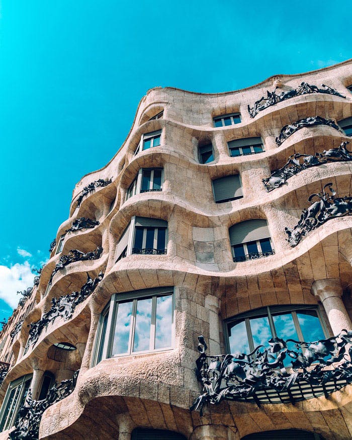
"title": "Barcelona",
"subtitle": "Dalí, Gaudí, Barrio Gotico",
"img": /"img/photo/barcelona.jpg",
"link": "category"
},
{
"title": "Prague",
"subtitle": "City of hundred towers",
"img": "/img/photo/prague.jpg",
"link": "category"
}
]
return (
<Swiper
className="mx-n2 pt-3 pb-5"
perView={1}
spaceBetween={20}
imgCards
loop
roundLengths
md={2}
lg={4}
data={slides}
/>
)
}Background Images Hero Slider
Parent element must have .position-relative and height set

import Swiper from '../../Swiper'

export default () => {

    const slides = [
            "photo-1501621965065-c6e1cf6b53e2.jpg",
            "photo-1519974719765-e6559eac2575.jpg",
            "photo-1490578474895-699cd4e2cf59.jpg",
            "photo-1534850336045-c6c6d287f89e.jpg"
    ]

    return (
        <Swiper
            className="hero-slider"
            wrapperClasses="dark-overlay"
            data={slides}
            simple={true}
            effect='fade'
            speed={2000}
            allowTouchMove={false}
            pagination={false}
            autoplay={true}
            delay={2000}
        />
    )
}
Avatar
Custom classes to format your user images. You can combine avatar classes with padding utility class to give to the image a nice white border.

.avatar-xxl p-2.avatar-xxl.avatar-xl.avatar-lg.avatar.avatar-smBackground image
Utility class that turns a <img className="bg-image"> into a background image for its background. Useful e.g. for carousels. Make sure that image's parent container and the content that should be placed over the image are relatively positioned.
I have a background image
Icons - Directory
This theme also comes with a 150+ Premium SVG icons. Icons included cover mostly e-commerce, restaurant and travel niches.
You can use new Icon component to conveniently display icons.
<Icon icon="smartphone-1" className="w-3rem h-3rem mb-5 svg-icon-light" />For a complete icon reference, see here.
Icons - Font Awesome
Vector icons and social logos on your website with Font Awesome, the web’s most popular icon set and toolkit.
These icons are mostly used in buttons or for social network links. For a complete icon reference, see here.
Image overlay
Utility class that darkens or lightens the backround image of the element to enhance the legibility. It can be used with cards, carousel slides, etc.
Gradient overlay adds vertical gradient that's darkest on the bottom third of the element.
Ribbon
Ribbons can be used in the venue component, venue carousels but also separately. Its parent needs a position: relative; and you can use theme colours for ribbon backgrounds.
Primary
Secondary
Info
Responsive borders
Responsive borders as an addition to Bootstrap's border utilities.
Class reference
.border-sm, .border-md, etc.
Block utilities
Additional utility classes, for block elements mostly.
Class reference
.bg-gray-100 to .bg-gray-900 - grayscale backgrounds
.bg-primary-light, .bg-secondary-light - lighter backgrounds for the theme colours
.opacity-1 to .opacity-9 - opacity helper
.hover-scale - scale element on hover
.hover-animate - move element up by few pixels on hover
.hover-scale-bg-image - scale element's background picture on hover
Text utilities
Additional utility classes, for block elements mostly.
Class reference
.text-gray-100 to .text-gray-900 - grayscale text colours
.text-sm, .text-lg, .text-xl - text sizes
.letter-spacing-1 to .letter-spacing-5 - letter spacing 0.1em to 0.5em
.z-index-1 to .z-index-5 - z-index from 10 to 50
.text-hover-primary, etc. - text colour on hover/focus for theme colours
.overflow-visible and .overflow-hidden - overflow control